Good Not Great Media focuses on integrating our passions at the intersection of technology and media to fulfill our client’s needs. We started with our experience in podcasting to videography to creative direction, brand kids, graphic design, creative technologies.
We are your pillars of experience for your clients.
Our Team
Sohil Sikdar
Hi, I'm Sohil, co-founder of Good Not Great Media with my partner/love of my life, Cas Cruz. I graduated UT - Austin with a degree in Radio, Television, & Film. I started out my career as a video producer especially in the sound department, and then I went into broadcasting professionally, learned a lot about streaming. And we launched Good Not Great recently and we provide creative direction and video services. We are your people!
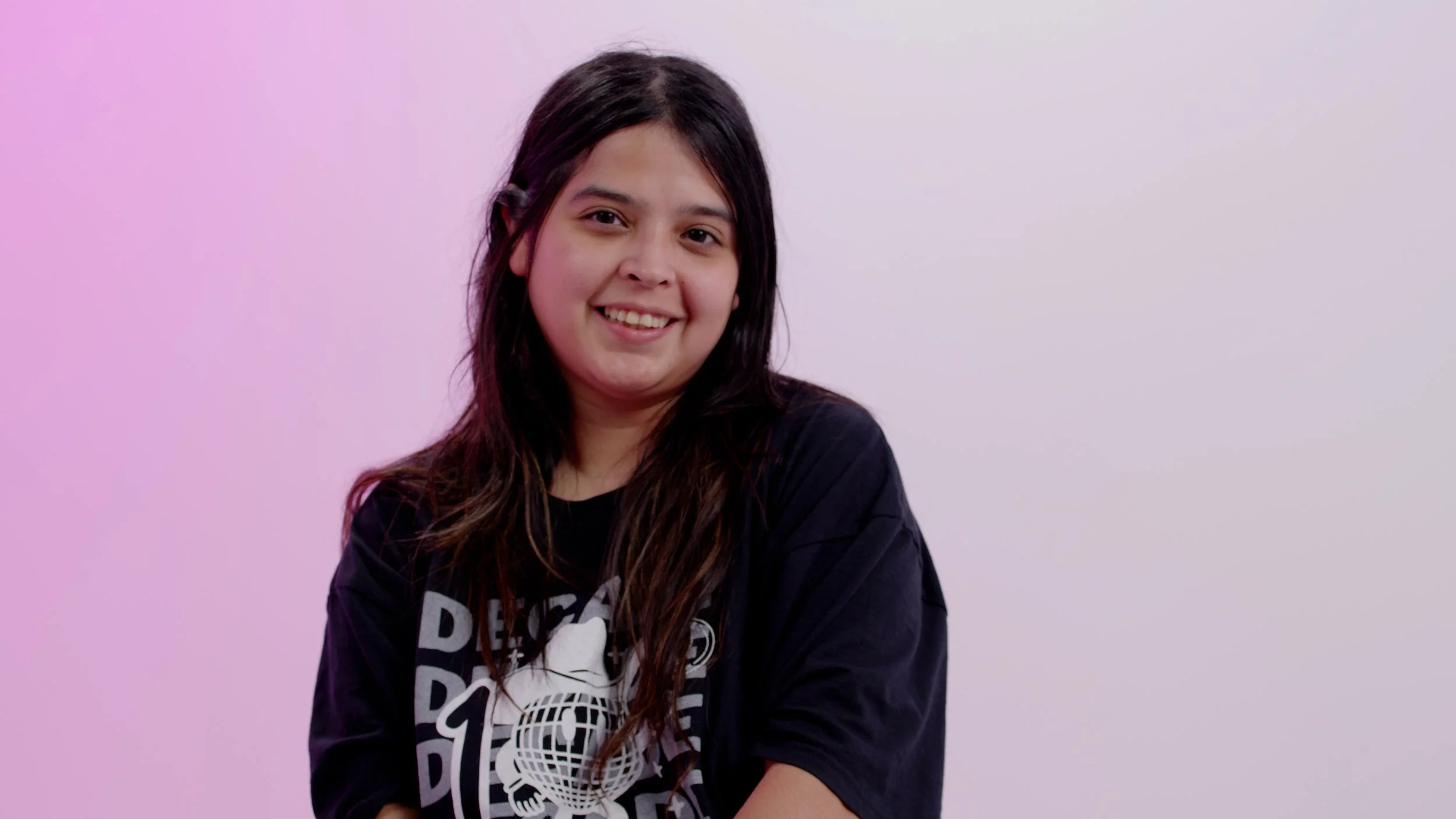
Cas Cruz
Hey, y'all, I'm Cas Cruz! I am one of the co-founders to Good Not Great Media with my partner and best friend, Sohil Sikdar. I have a background in art, coding, front end web development and graduated in UT - Arlington with a degree in Communication Technology.
I am a creative technologist; what it means to me is making art for different mediums. There's always different ways we can use emerging technologies to enhance brands. With both of our backgrounds combined, there's no limit to what we can do.
Our services are provided to businesses, organizations, and creative individuals looking to elevate their online presence, which in turn can evolve into real-world connections! Feel free to explore each service for additional details.
Curious about what we specialize in?


Featured Clients and Projects
-
![]()
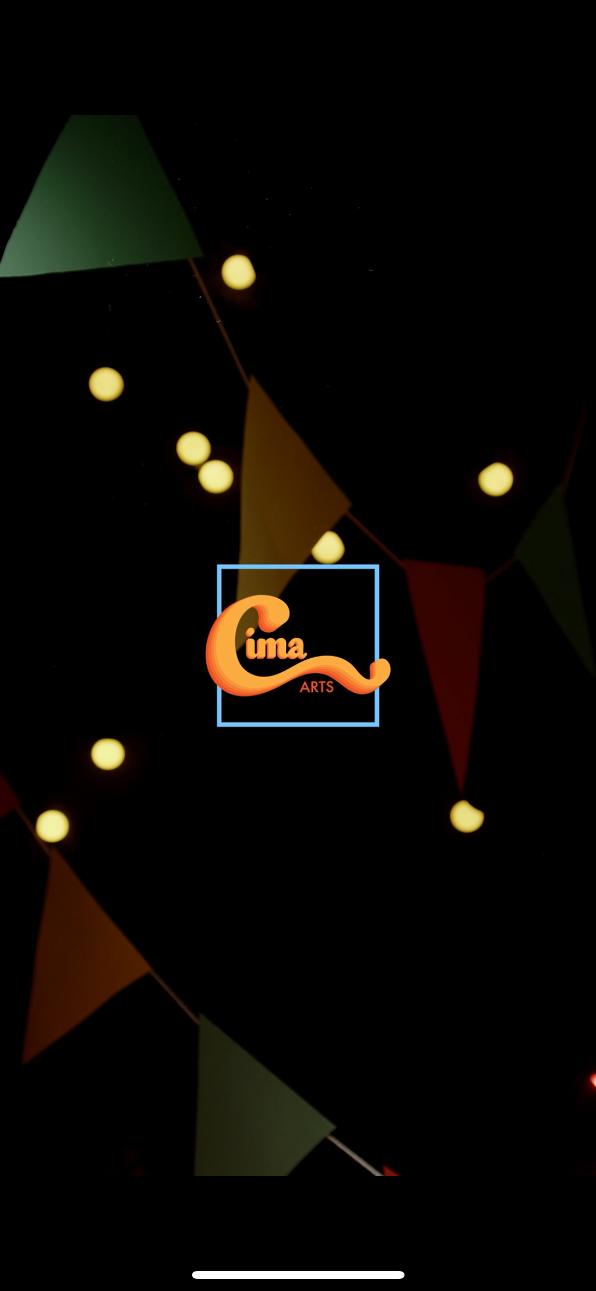
Cima Arts
-
![]()
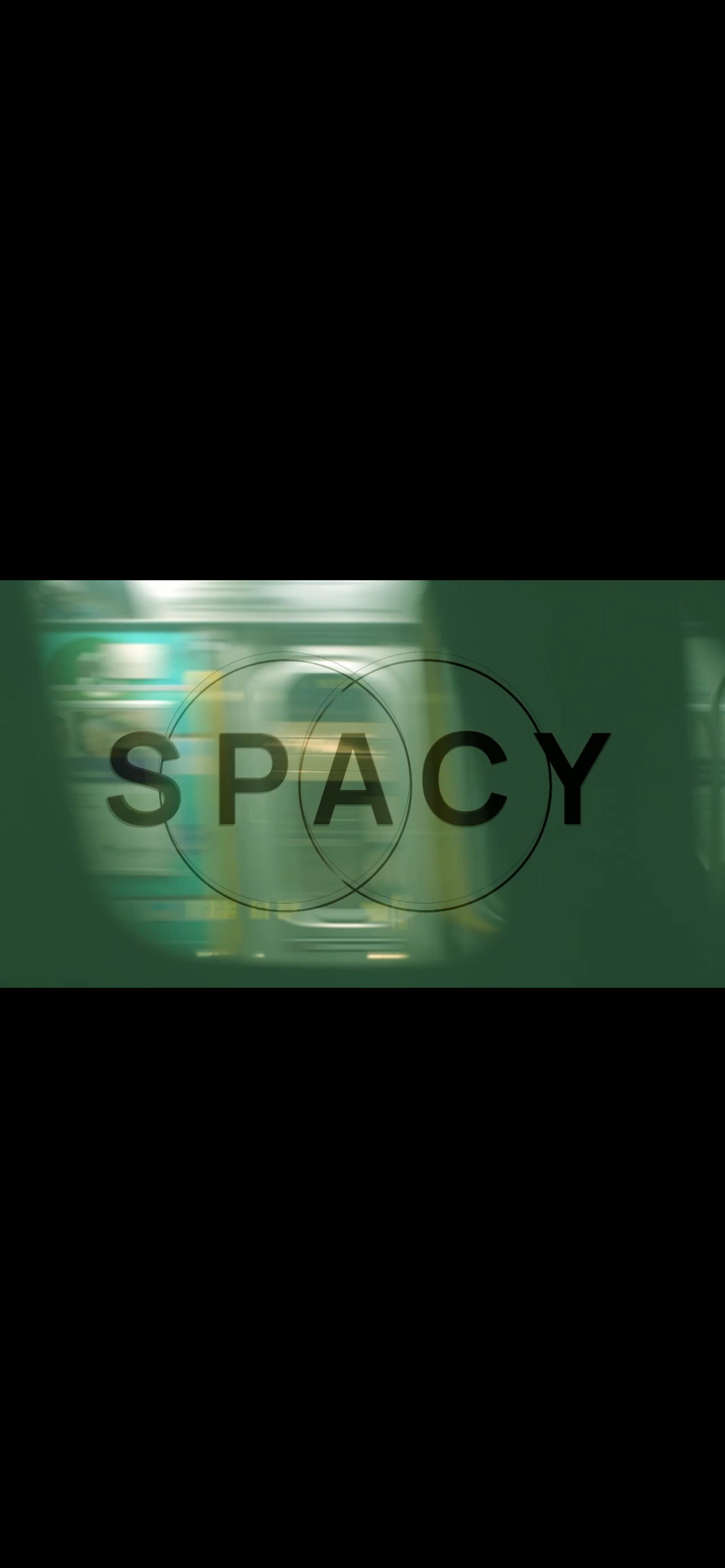
Spacy DTX
-
![]()
LAFFD
-
![]()
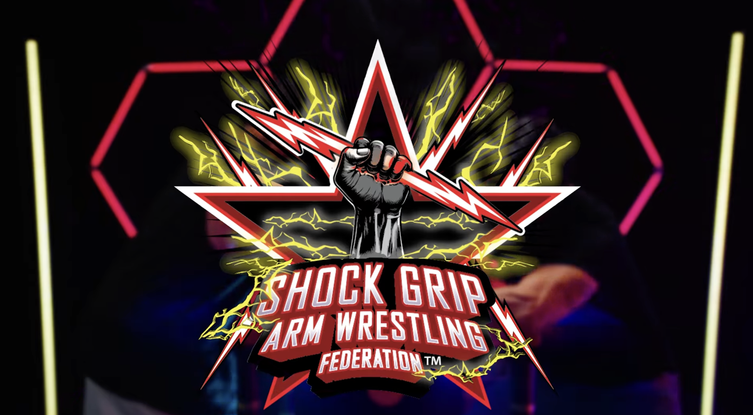
Shock Grip Arm Wrestling
-
![]()
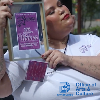
214 Selena
-
![]()
Money In The Bank With Franck
-
![]()
Sports Fishing Championship 2025
-
![]()
KinISO
-
![]()
Harper Belmont Media
-
![]()
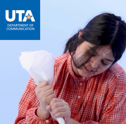
UT - Arlington
-
![]()
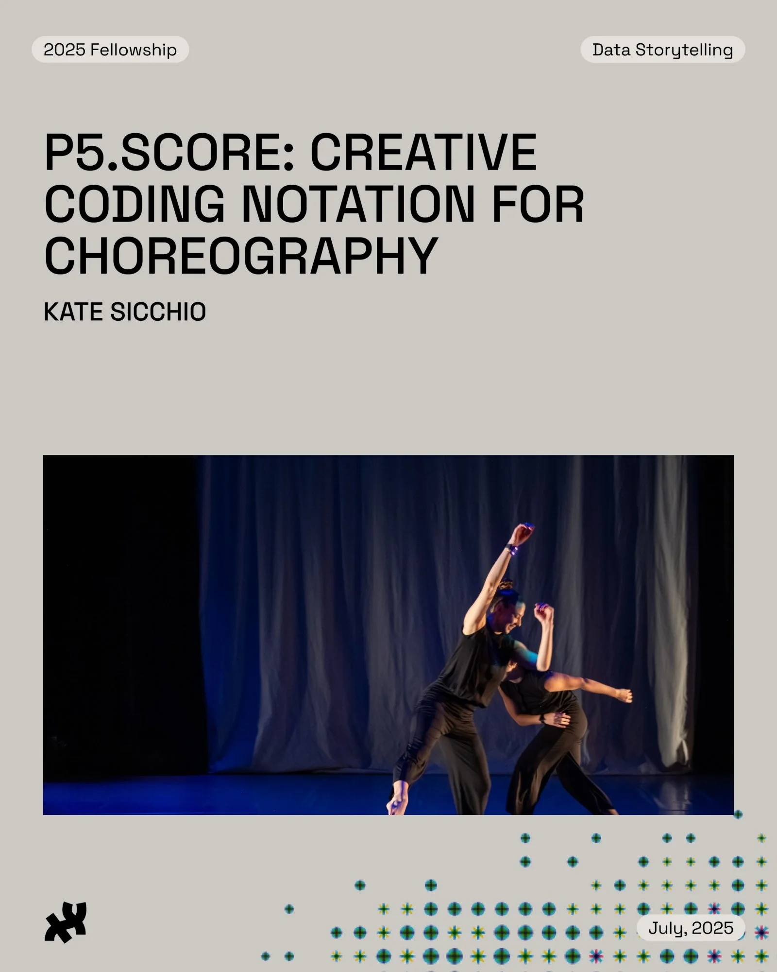
Processing Foundation
-
![]()
NTS Supporter Radio
-
![]()
Swirled Peace
-
![]()
Pilou44